PT/BR
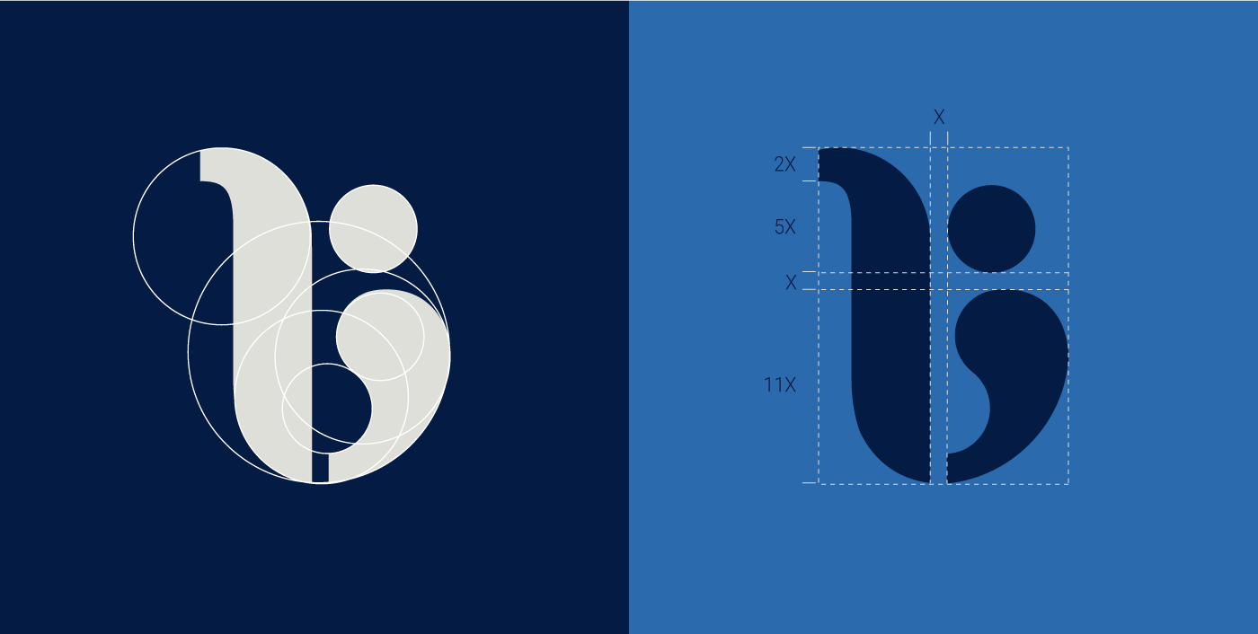
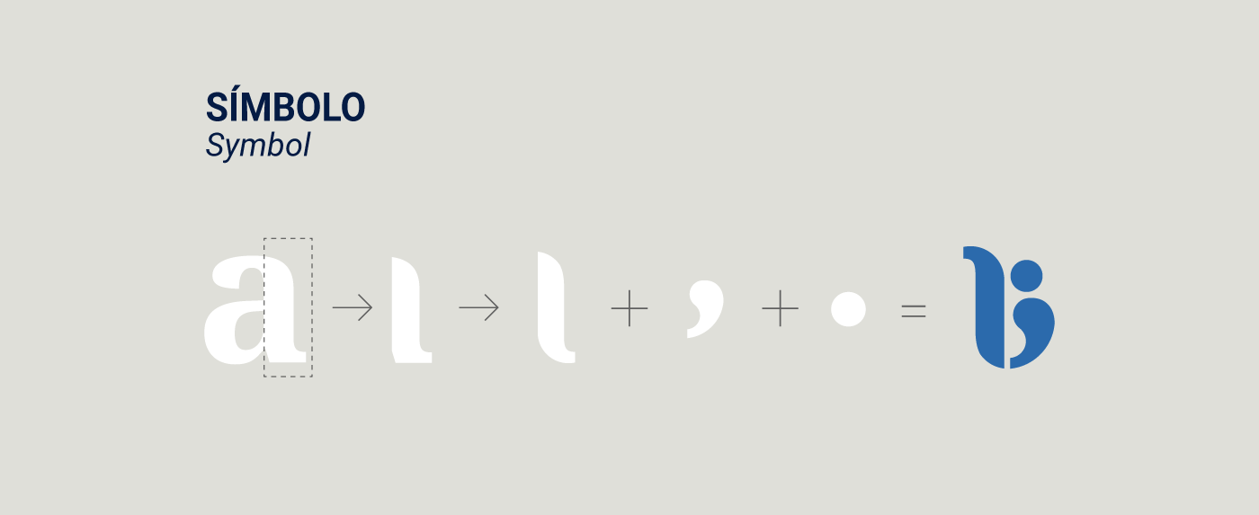
A nova marca da Biblioteca UNESP Bauru conta com um símbolo que faz referência à letra “B”, presente nas palavras “Biblioteca” e “Bauru”. Este B, por sua vez tem a formação composta pela haste cortada e invertida do carácter “a” em caixa baixa. Aliado a esta forma está o bojo à direita do ícone, formado por um ponto e uma vírgula. Estes caracteres tipográficos não foram escolhidos por acaso, ambos são a letra e pontuações mais utilizadas na língua portuguesa. Em uma segunda leitura, podemos observar um usuário (ponto e vírgula) em frente a uma estante de livros (haste do a).
EN
The new brand of UNESP Bauru Library represents a symbol that makes reference to the letter "B", present in the words "Library" (PT: Biblioteca) and "Bauru". This B, is formed by the cut and inverted stem of the character "a" in lower case. Allied to this shape is the bulge to the right of the icon, formed by a period and a comma. These typographical characters were not chosen by chance, both are the most used letter and punctuation in the Portuguese language. In a second reading, we can observe a user (period and comma) in front of a bookcase ("A" stem).